by
Laura Huff
| Nov 10, 2016
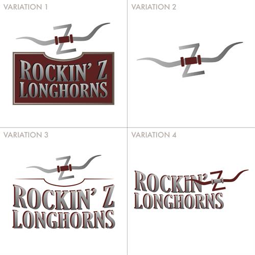
We recently had a customer, Rockin’ Z Longhorns, request a logo design with a few variations. Below we explain why having a set of logos can be a great idea as a ranch works on building their brand.
First, check out the four different variations we designed, then scroll down to read our thoughts on where each option works best.

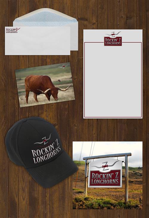
Variation 1 is the most complete logo. It has the most detail and color. We have shown it on a letterhead and a ranch sign in our example below. This logo is bold with the maroon background and attracts a lot of attention.
Variation 2 is the most simplified, it is a recognizable symbol without the added wording. It could easily be used as a brand for the Rockin’ Z Longhorns herd. We have shown it as a watermark for the photos they share online. The small graphic added to the corner of any image lets the viewer know right away it came from this ranch.
Variation 3 still contains all of the elements from the original, but it eliminates the background to help the text stand out in areas where it may be difficult to read. The third variation appears much cleaner on this black hat.
Variation 4 has made the logo more horizontal. The full Rockin’ Z Longhorns name appears, but without the added height that occurs in variations 1 and 3. This version is perfect for envelopes and other marketing materials with limited space.

If you have ever had trouble fitting your logo into a space or have had trouble making it stand out, we can help! Have your own set of logos designed, or we can work from the ground up to create a whole new brand for you.
Contact us to get started.